discovery+
I was able to take the bones from work we had done prior to discovery+ to lead a very small team to complete the core end-to-end experience in just 3 months. Here are some highlights from discovery+ of screens in market as well as some concepts like the EPG that weren’t released.

discovery+ - home
We tested several different approaches including one that led with the network brands. When participants were asked which organizing principle was best for discovering something new to watch, it was clear that genre was the way to go for this library.


discovery+ - details
Both the Home Screen and Details were designed to support video (no scary audio) previews of the content. Test participants found the video previews made them far more likely to watch content and it was clearly an effective aid to content discovery.

discovery+ - plan selection
I explored so many approaches for how we might best support annual plans (or more) without adding friction to the plan selection screen. More options = more friction. This was my ultimate solve, a modular system designed to elevate the two lead offers while providing an annual option for one or both of those plans. This design is extensible to support more packages and bundles as well and works across device screens.


discovery+ - channels
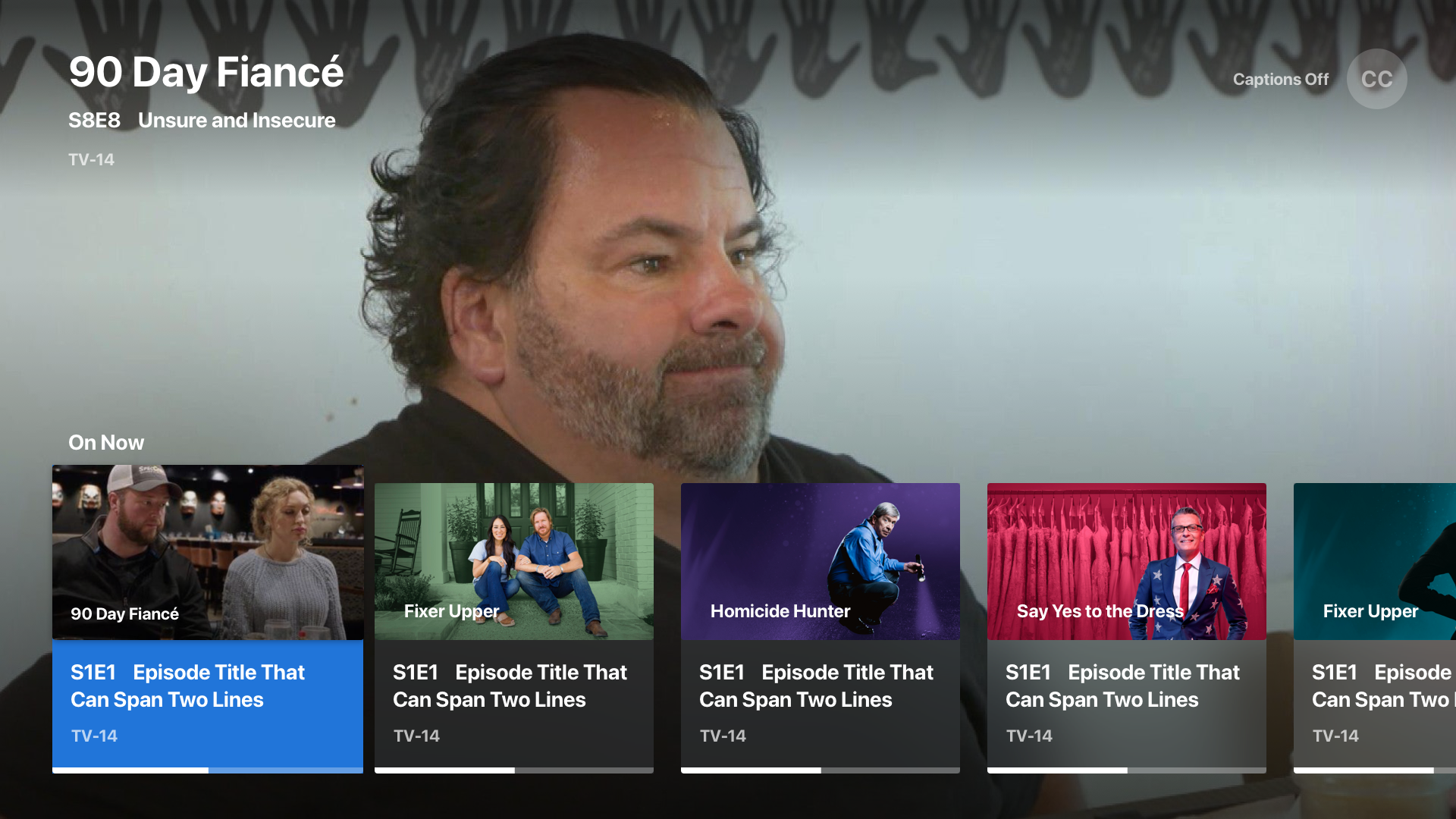
These are already on join-in-progress linear streams of episodes of a show, franchise, or theme. As a fast follow to the channels feature, an EPG was to enable users to jump from channel to channel without leaving playback.


discovery+ - channel guide
I designed a horizontal card-based approach as well as a more traditional EPG approach. Research showed that people were split down the middle on preference, but that the traditional guide was more familiar.

discovery+ - profiles
I included these examples because I like the balance and minimalism of the layouts and how we were able to add new features such as parental controls without adversely impacting the simplicity.


discovery+ - new merchandising components
I designed our multiscreen “inline hero” and “large tiles” so that we could promote content further down the rail stack and break up the monotony of the vertical scroll.
